
Wednesday, May 24, 2006
My Next Program
Below is the logo for my next program, InkChat. The program allows you to chat with your friends not only with text, but also with a pen! Anyway, I'd really appreciate everyone's opinions about the logo. And don't say it's good because you know me, or don't want to offend me. I'd be offended if you couldn't be honest enough to say it needed some work. Because obviously it does. My main dilemma right now is the ink puddle, and the splotch under the "k" do I include those or not?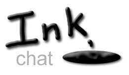
Subscribe to:
Post Comments (Atom)

4 comments:
You know, I think that I'd prefer the logo sans blotch and puddle - I think that it would be much cleaner with only the words "Ink chat". If you do keep the puddle, maybe you could make the border less strictly geometric?
P.S. - I like the logo :)
I have two options to suggest:
#1 Remove the ink drop and puddle and shift Chat to the right:
Ink
Chat
The Ink would would be slanted handwritten cursive and Chat can stay in printed text.
#2 Correct the ink drop and puddle. Now the ink drop looks more like a coma. I would make the ink puddle more rounded with rippe effect. See the following links for ideas: http://artisticstudies.com/photos/logos/logos.pw/logo.pw.3.large.jpg
http://www1.istockphoto.com/file_thumbview_approve/230597/2/istockphoto_230597_paint_splatter_black.jpg
http://www.cartridgesaver.co.uk/images/NewInkDrop.jpg
http://www.inkfo-server.co.uk/drop.gif
http://www.wingimp.org/tutorial/th_ink_drop.gif
http://www.istockphoto.com/file_thumbview_approve/125618/2/istockphoto_125618_ink_stains_photoshop_brush.jpg
http://www.inkdrop.com/images/idmgws_01.gif
Julia, when are you going to update your LJ? It is much easier to keep track of what is going on there than on the BLOGSPOT. Your friends have been patiently waiting for the update for over a year. Come back to LJ!
MuirZilla
Post a Comment